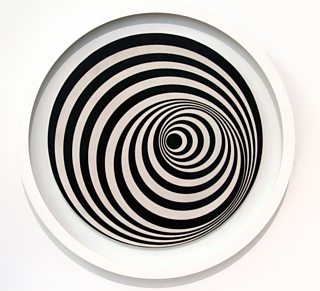
Following on about the Rod Stewart Vertigo albums in the post below, l would not like to cast aspersions about where the vertigo design came from, but l have a sneaking suspicion that whoever designed it may have seen the 'Uneasy Centre' Op Art by Bridget Riley (1963), which is below.

Compare and contrast to the Vertigo version.

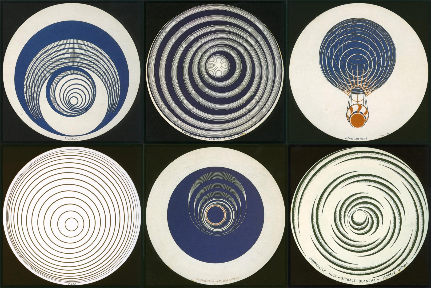
The art team of Linda Glover and Mike Stanford, (based on an idea by Olav Wyper) were meant to be inspired by Marcel Duchamp's Rotoreliefs (below), but who knows?

Despite how great l think the label design is, I can think of only one punishment that should have been administered for the possible 'inspiration'.
toodle pip

Compare and contrast to the Vertigo version.

The art team of Linda Glover and Mike Stanford, (based on an idea by Olav Wyper) were meant to be inspired by Marcel Duchamp's Rotoreliefs (below), but who knows?

Despite how great l think the label design is, I can think of only one punishment that should have been administered for the possible 'inspiration'.
toodle pip


